At the latest Apple event, as always, new features for the Apple Watch, AirPods Pro 2, and iPhone were introduced. While all were impressive, the absolute standout for me was the Dynamic Island of the iPhone 14 Pro. 💫
Every phone maker and user dreams of a front display filled with pixels. Yet, due to the need for camera lenses or sensors, some areas remain untouched by pixels. Initially, lenses were placed at the top, but now, with the trend of minimizing bezels, they’re typically embedded within the screen. Hence, iPhones have a notch, and Galaxies have punch-hole displays. These areas are mechanical dead zones, limiting display use from a UX perspective. It’s a clear limitation and a major drawback of front displays.
Apple, however, flipped the script by turning this limitation into a spotlight feature. (Hallelujah!) They use the area around the dead pixels for notifications, alarms, and other app activities. What could be seen as a flaw is now a captivating info hub. They’ve turned hardware limits into a software-driven UX triumph. 🎉
The Dynamic Island constantly morphs, ensuring you never realize it’s the camera zone. True to its name, it dynamically changes to present various information. Yes, dead pixels remain, but the evolving and dazzling interface keeps users mesmerized. 🌟
The dead pixel area appears dark and unlit. Apple defines the Dynamic Island’s background as black, dynamically adjusting the screen around it, making it look like a deliberately designed info board. Strategically placing icons and content is a given, right? 😉
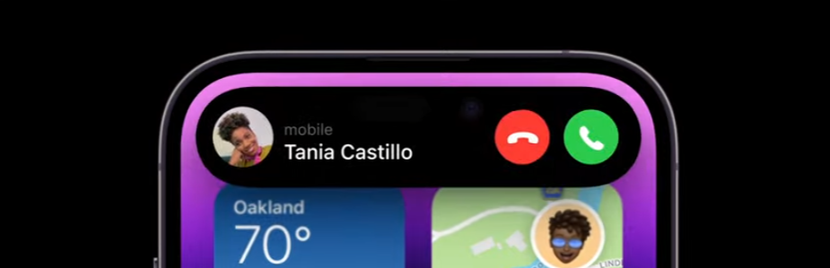
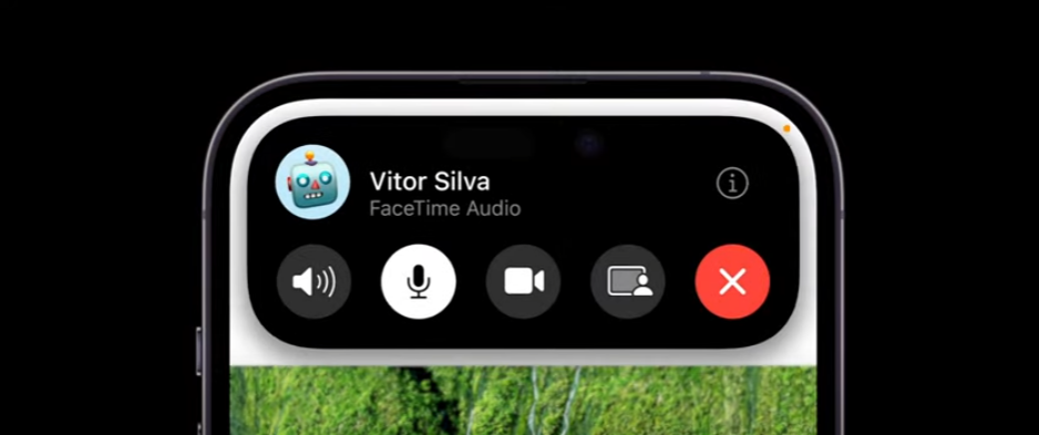
It even boldly overlaps with the time, carrier signal, or battery areas,
transforming into new shapes so the dead pixel zone becomes unnoticeable.
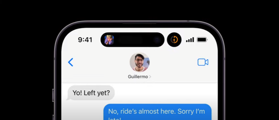
It showcases album art in real-time while music plays in the background,
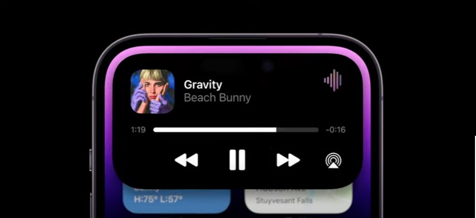
and expands with a touch to reveal even more information. This area isn’t just a bulletin board but a dynamic space for interactive interaction with your device. 🚀
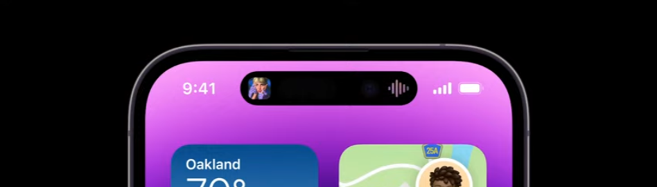
Of course, there’s always that dead pixel spot at the top center.
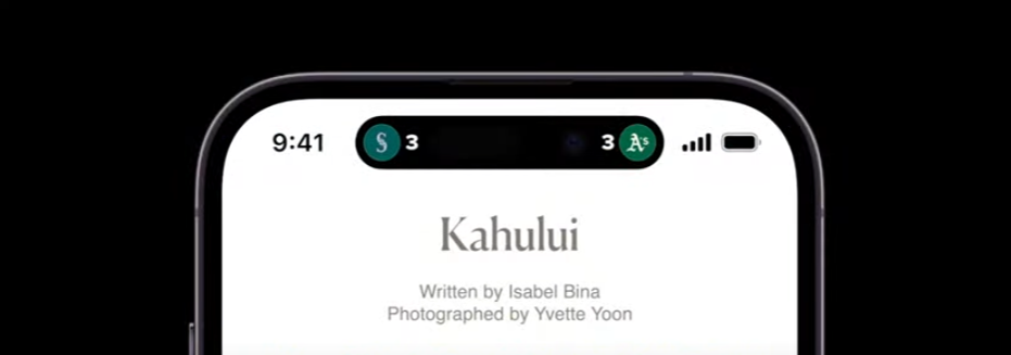
Apple has opened up this area to third-party developers, allowing for even more diverse info displays.
The first release even supports doubling with multiple apps’ background info, showing the immense thought put into it. It’s packed with almost everything imaginable. From a UX perspective, Dynamic Island is a revelation. It’s been years since an announcement made me want to dive into related APIs, not since the app clips two years ago! 📱
Honestly, in recent years, besides camera advancements, there hasn’t been much to capture my interest, making my annual phone upgrades less appealing. But this Dynamic Island is so intriguing that I’m considering an upgrade, even though I just did last year! 😄
Leave a Reply