I’ve lost track of how many times I’ve revamped the retirement analysis graph.
As we gear up for launch, I question if this is the right approach. But from a casual user’s perspective, who might not care much for graphs, they might just end up scratching their heads. That’s why I keep tweaking it. If we only focus on cash flow (retirement funds, pensions, and other incomes), it would be easier to understand and much simpler to handle. Maybe that’s the real answer. Yet, I want to show that assets exist up to a point and how much they can cover. Sure, assets will keep changing, and what I’m presenting might not be entirely accurate. But I want to ensure nothing gets overlooked and everything is viewed from a holistic perspective. This might prompt users to find their own solutions.
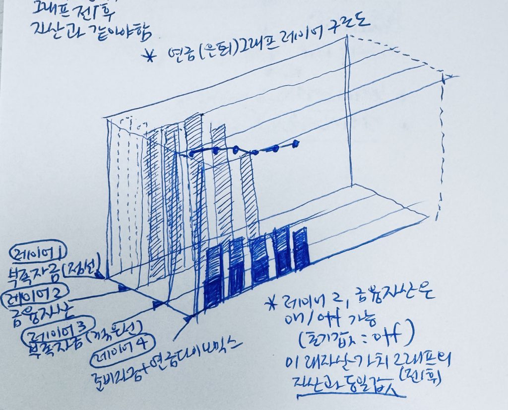
Thanks to this, the graph always feels intricate. Trying to pack everything into a flat graph means that without precise design for each layer, the intent won’t get through to users. We’ve even gone back to square one during changes, and I can only imagine how frustrating that must be for developers and others. I’d hate it too. Since we need to create a video manual, no more changes can be made. Please let this be the final version…
But hey… we’re almost there. 🌟
Leave a Reply